Pearl.
Lock in, Lock out, and Repeat

Lock in, Lock out, and Repeat
Pearl is a Pomodoro timer app designed to help users build mindful digital habits through gentle encouragement and positive reinforcement. Unlike traditional productivity apps that rely on guilt-based nudges, Pearl creates an engaging underwater-themed experience that makes focus feel enjoyable.
Amid constant notifications, doomscrolling, and digital fatigue, people are craving healthier ways to use their screens. Apple's Screen Time and Google's Digital Wellbeing offer options, but they often feel passive, confusing, or too easy to ignore. What's missing is a more engaging, personalized approach to truly shift digital habits.
Design a mobile app that helps users build mindful digital habits in fun and engaging ways. The app should focus on encouraging healthy screen usage without relying on guilt or restriction. You may incorporate gamification, journaling, social accountability, or mindfulness elements.
Despite available solutions, users often:
How might we design a mobile app that promotes mindful digital habits in fun and engaging ways, without guilt or restriction?
We evaluated popular productivity and digital wellbeing apps, such as Flora, Focus Keeper, and Screen Time, to understand their success and shortcomings in supporting healthy screen habits for college students.
Our aim was to create a streamlined, all-in-one solution that cut down on excessive screen time, staying true to our mission of reducing digital distractions. We focused on a clean, welcoming interface and, after several design iterations, developed these three polished concepts.
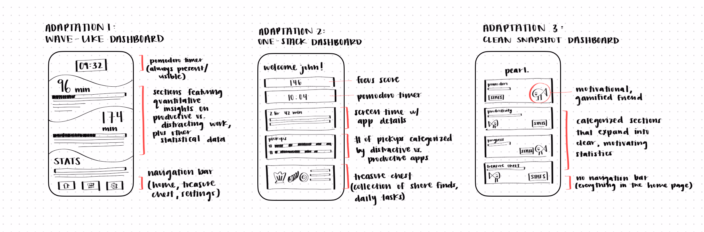
We chose Adaptation 3, simplifying the homepage by removing excess boxes and organizing everything into folders for a cleaner, more inviting look. This version highlights four core categories—Pomodoro, Productivity, Progress, and Treasure Chest. Within each, users can adjust settings like timer length or daily tasks, offering just enough customization to stay engaged without losing focus. This process helped us refine the preliminary information architecture that will guide our app’s design.

The Pomodoro timer guides users through setting preferences, focusing during work and breaks, and finally viewing a summary of their progress and rewards.
The Productivity flow gives users a clear snapshot of their screen habits. They can tag apps as productive or distracting, then review visualizations of screen time, pickups, and Pomodoro sessions to better understand how their time is being used.
The Treasure Chest feature promotes mindful breaks during Pomodoro sessions by suggesting creative daily tasks. Completing them earns shells, rewarding users with playful progress and surprises to unlock.
The Progress screen keeps users motivated by tracking daily Pomodoro streaks, celebrating usage milestones, and showing long-term consistency through a calendar heatmap.
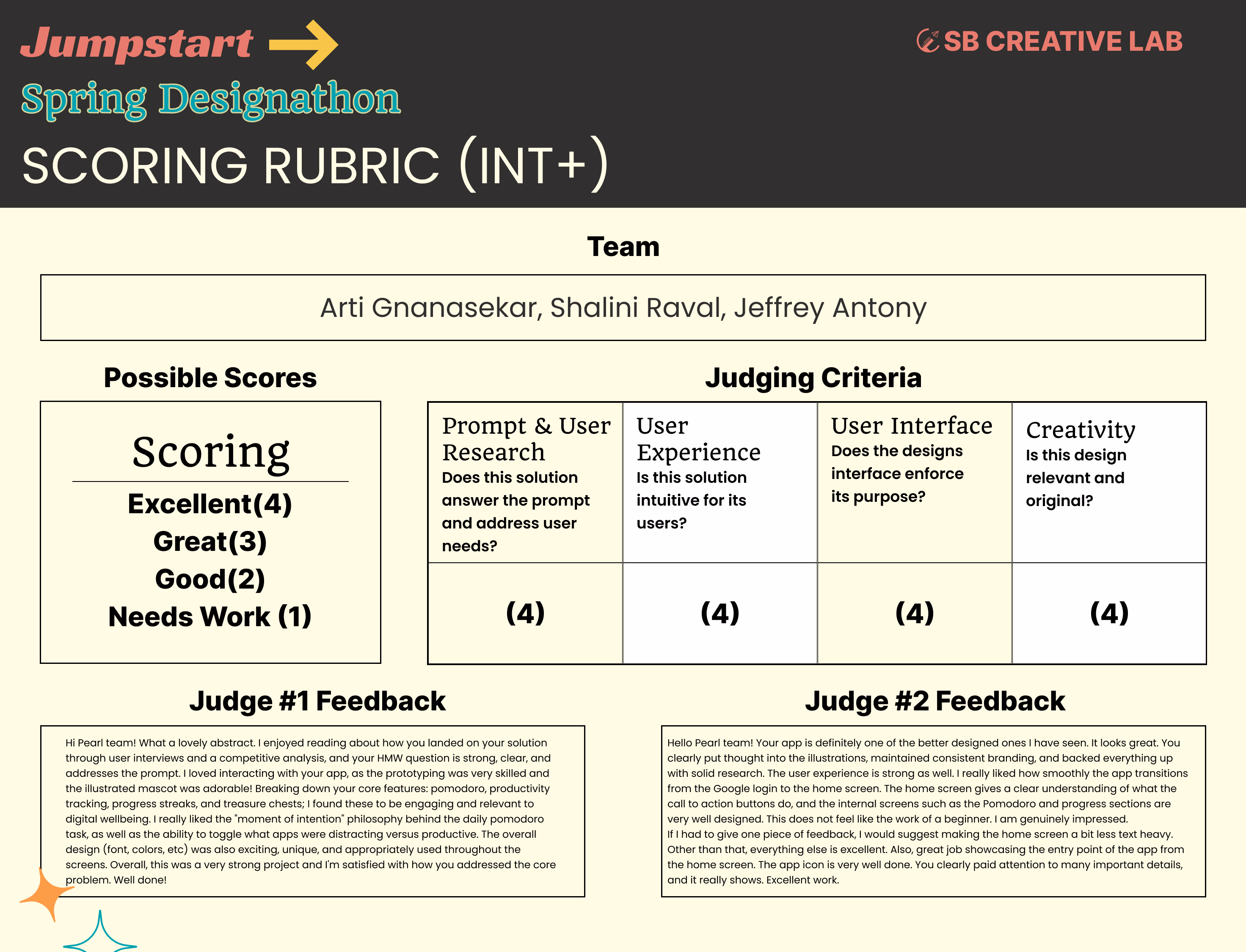
Our final Pearl prototype was evaluated at the Jumpstart Spring Designathon, earning perfect scores in user research, experience, interface, and creativity. The judges recognized the strength of our concept, execution, and focus on user needs earning us First Place!